2012 - Lead UX Designer
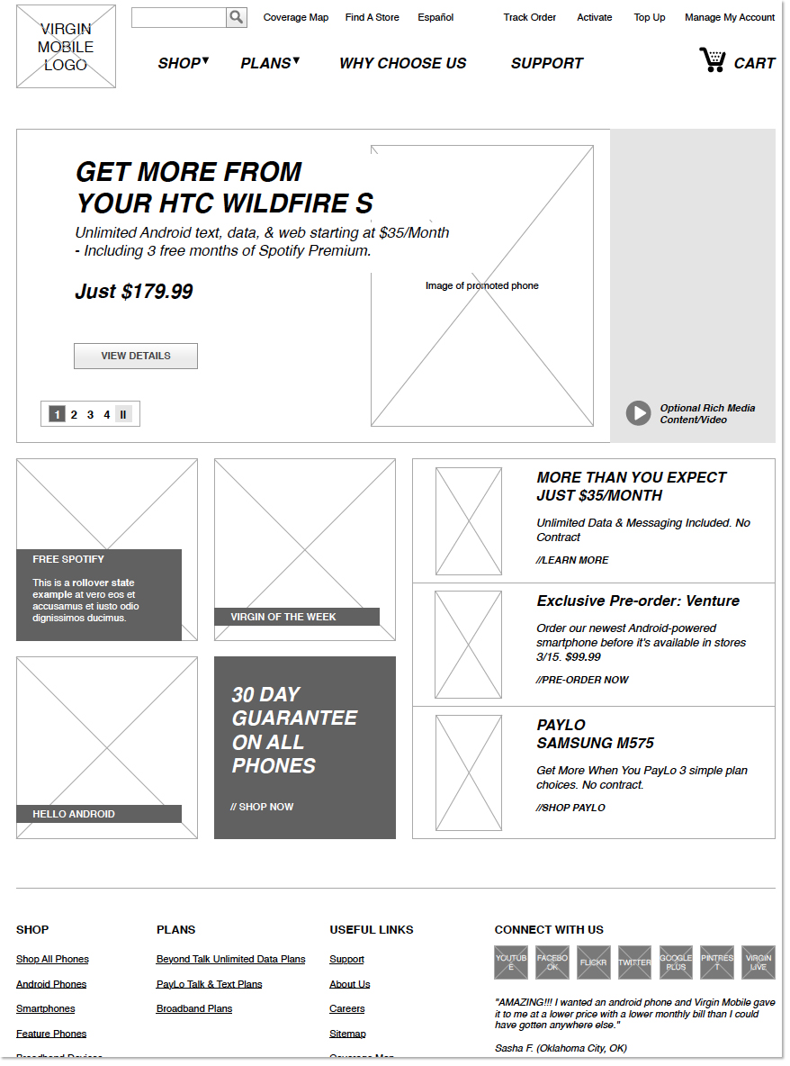
The Virgin Mobile website didn’t always look this stylish, back in 2012 BEAM Interactive was asked to update the website to attract a new audience for their offerings.
We had to integrate a new product line (Android smartphones)while distinguishing them from the PayLo product line that would offer the standard phones that Virgin Mobile were known for selling.
The project took about 8 months and was a complete rethinking of the UI/UX. The redesigned site helped increase online sales by 28%.
2014 - Lead UX Designer
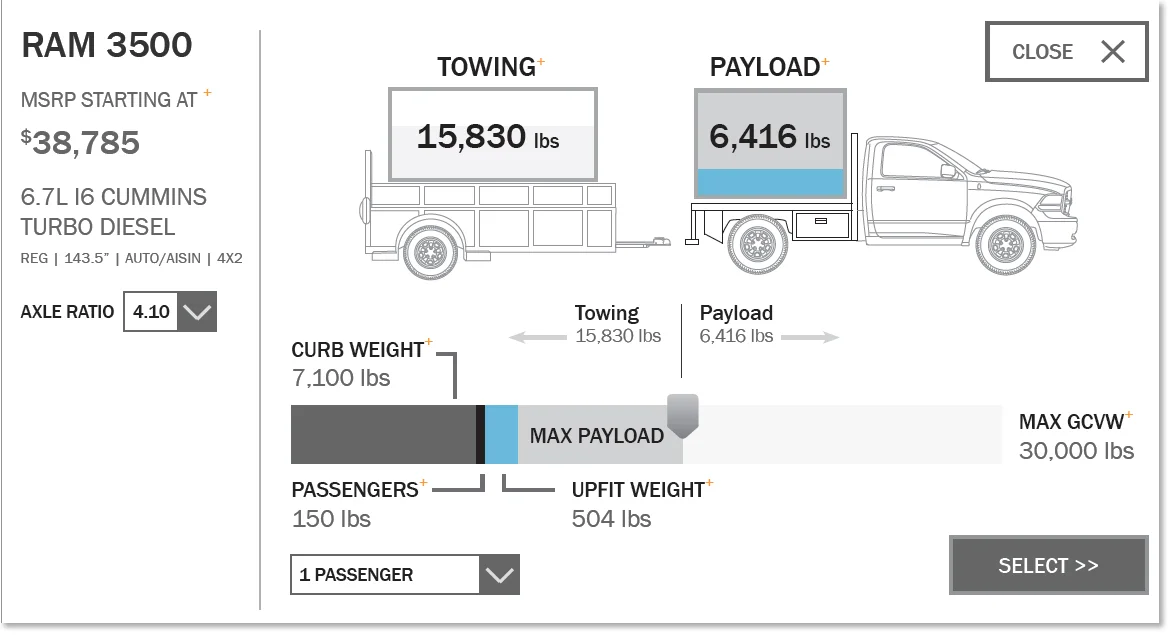
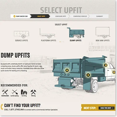
Commercial customers aren’t just buying a truck, but plan on installing aftermarket heavy machinery like hydraulic lifts and cranes.
The Upfit Guide focuses on defining the needs of the customer first and then matching them to the vehicles that can safely handle the weight and power requirements needed for the job.
The tool not only helps customers find the right vehicles but also is used by dealers nationwide as a consultation tool in the showroom.
2012 - Lead UX Designer
Staples needed a better way to process custom orders. Their old system was a set of notes written on the back of an envelope. Staples wanted a way to digitally capture the order and tie into their inventory management system.
The existing order envelope was used as a starting point. We wanted to design a touch screen interface that would be intuitive for employees used to their old system.
A concept video was produced to pitch the idea to senior executives at Staples. An imagined store of the future where our interface was the center of the Copy & Print department.
We worked with the client's product team to create a complete list of ordering options and business rules. We then broke down each element into a series of icons that would allow for quick selections.
User testing was done early in the UX process with lo-fidelity clickable prototypes on tablets. The Solution Builder went through three rounds of testing at select Copy and Print Departments.
The system has been rolled out nationwide to approximately 1,600 Staples stores.
2014 - Lead UX Designer
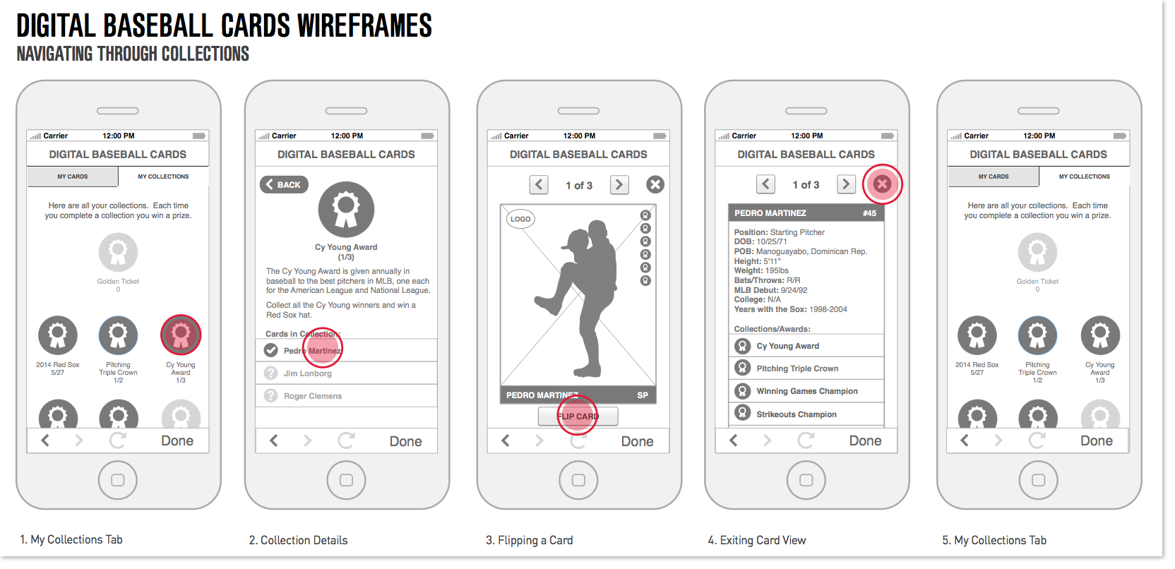
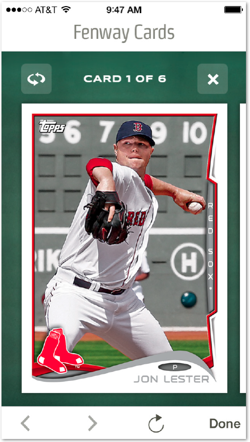
In 2014 the MLB started integrating iBeacon technology into a few test market stadiums. To compliment this initiative they asked each team to come up with a unique in-app experience for their franchise. The experience needed to be contained within the MLB app and could not infringe on any existing apps or content that MLB already had.
We came up with the idea of digital baseball cards of the current Red Sox roster and notable players from the team's past. Every time a fan attended a game they could earn a "pack" of six cards through the app. At each game the user could be lucky enough to get a Golden Ticket for a truly special experience a the current game. Users could also win prizes over time by completing collections, such as collecting all the Golden Glove winners.
2014 - Lead UX Designer
We worked with The Boston Globe to consolidate their member center and improve their registration process.
The existing member center forced the user had to jump between three visually distinct sites in order to complete basic account setting tasks.
We worked with The Boston Globe to define all the essential functionality and create a system where any task could be completed within three clicks.
To improve the signup process, we created a journey of the current registration process and identified the steps that could be cut out to streamline the process.
2017 - Lead UX Designer
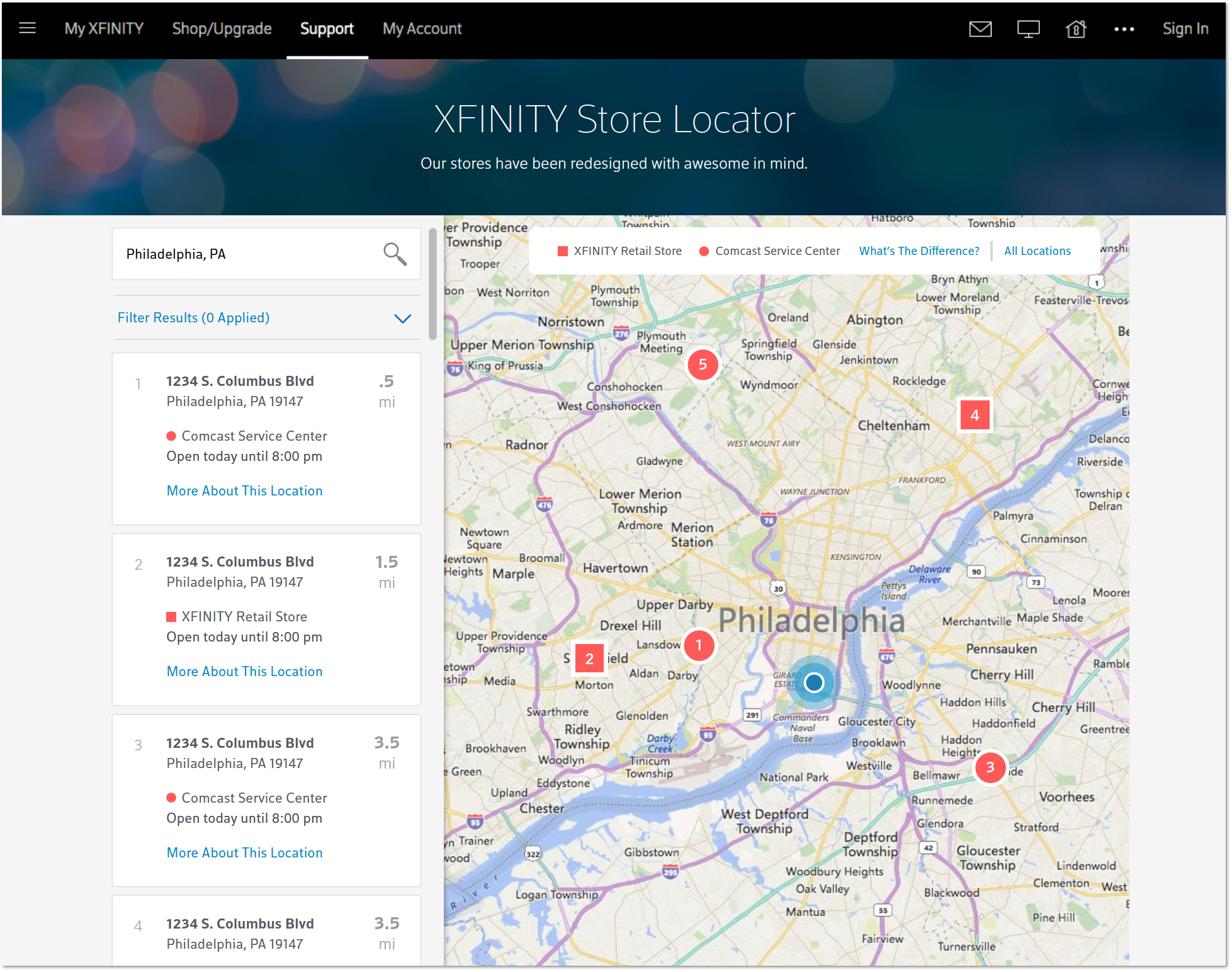
Comcast asked us to update their store locator and store landing pages. Both the store locator and landing pages needed to adhere to responsive design and scale multiple types of stores with varying levels of content. The catch was that we would only have 7 weeks to work on the project.
We set the expectation upfront with the client that the creative team would be strictly focused on working iteratively through the course of the project. We did not have time to create fancy decks and have multiple stakeholder reviews, instead we would turn our review sessions into work sessions and invite our stakeholders to become creative collaborators.
We settled on using whiteboard sketches as our wireframes, we transitioned straight to design as soon as the concept had been vetted with the client and approved by the client. This allowed UX to immediately start writing stories for a backlog, our preferred handoff documentation, while Design would have more time to experiment with the visual direction.
Work was shared with clients in weekly “demos” which were open to any stakeholder to attend. The work was often shown within Sketch or as a low-fidelity InVision prototype, in order to collect as much feedback as possible and minimize time spent on creating presentation materials.
The results of the process speak for themselves. Within 4 months of the project start date, the store locator and redesigned store landing pages were up and running on the Xfinity.com main site. Comcast reached out to tell us that the redesign has seen a 120% increase in page visits when comparing January ’17/’18 statistics.